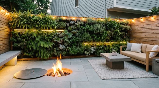
As the heart of the home, the living room serves as a multi-functional sanctuary for both social gatherings and private relaxation, notes Jambi Property Management Lawndale. Choosing the right color ideas to paint living room spaces is a pivotal decision that defines the atmosphere of your entire residence. In 2026, the shift away from sterile, cool grays has fully materialized, replaced by a sophisticated palette of earthy neutrals and muted jewel tones. These emerging trends prioritize warmth, comfort, and a deep connection to the natural world, reflecting a collective desire for interiors that feel grounded and authentically lived-in.
The 2026 Palette: Earthy Neutrals and Muted Jewels
For 2026, living room color trends are pivoting toward “nature-inspired warmth,” moving away from the sterile grays of the previous decade. Key shades include muddy greens, dusky pinks, and muted teals that offer a grounded yet sophisticated feel, perfectly balancing comfort with modern editorial style. According to Homes & Gardens (2026), these “softly nuanced hues” are essential for creating a space that feels both timeless and inviting [1].
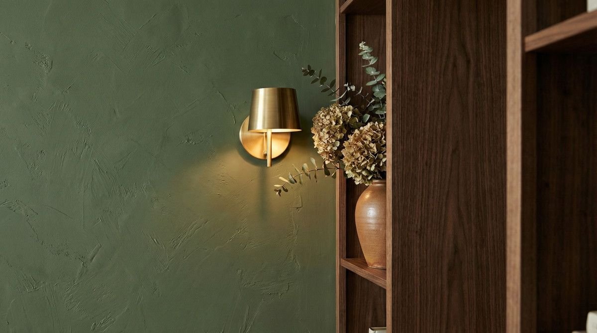
Muddy Greens and Olive Tones
Rich, muddy greens like “Gloucester Sage” and “Bancha” have become the new neutrals for 2026 living rooms. Unlike the bright, botanical greens of the past, these olive-based shades offer a sophisticated depth that reads as a deep neutral rather than a bold accent color. They serve as an exceptional backdrop for natural materials like walnut wood, aged brass, and textured linens, making them a top choice for designers seeking to bring the outdoors in.
Dusky Pinks and Plaster Tones
Plaster-inspired pinks, such as “Dead Salmon,” are redefining how we use color in common areas. These shades are far from the “millennial pink” of previous years; instead, they possess a muddy, earthy quality that functions as a warm neutral. These dusky tones add a subtle glow to the room, especially during the “golden hour,” creating a cozy and intimate environment that feels both historic and contemporary.
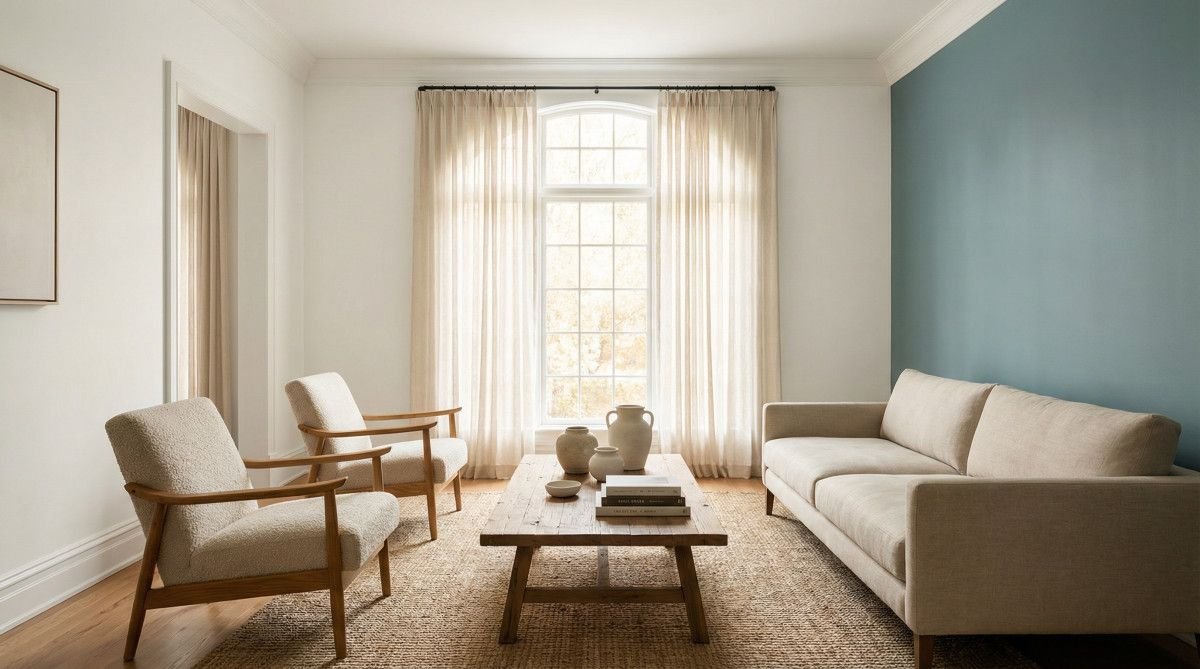
Muted Teals and Inky Blues
Muted teals and inky blues offer a serene alternative for those who prefer a cooler palette. Shades like “Atmospheric” and “Dix Blue” bridge the gap between blue and green, providing a calming influence that is perfect for large living spaces. These colors are particularly effective when layered with rich emeralds or warm caramels, adding a sense of luxury without overwhelming the architectural features of the room.
| Color Category | Representative Shade | Primary Mood | Best Pairing |
|---|---|---|---|
| Muddy Green | Gloucester Sage | Grounded, Organic | Brass & Walnut |
| Dusky Pink | Dead Salmon | Warm, Sophisticated | Linen & Stone |
| Muted Teal | Atmospheric | Serene, Modern | Caramel & Gold |
| Warm White | Alabaster | Airy, Timeless | Oak & Wool |
Lighting and Orientation: Choosing the Right Undertone
Selecting the perfect living room paint requires understanding how natural light interacts with specific pigments throughout the day. North-facing rooms benefit from warm-based neutrals to counteract cool blue light, while South-facing spaces can handle cooler, more saturated tones without feeling icy or uninviting to guests. According to Sherwin-Williams (2026), the key to a successful color scheme is sampling shades in different lighting conditions to see how they shift from morning to evening [2].
North-Facing Rooms: Boosting Warmth
North-facing living rooms often receive a consistent, cool blue light that can make neutral colors look flat or even slightly gray-blue. To combat this, designers recommend choosing colors with yellow or red undertones. Warm whites like “Dover White” or soft terracottas can breathe life into these spaces, making them feel sun-drenched even on overcast days. Avoid cool grays or blues in these rooms, as they can quickly feel cold and uninviting.
South-Facing Rooms: Balancing Saturation
South-facing rooms are blessed with intense, warm light throughout the day, which can make even the most subtle colors appear highly saturated. This is the ideal environment for cooler tones like soft blues or crisp whites. Colors like “Sea Salt” or “Silver Satin” thrive in this orientation, maintaining their clarity and freshness under the midday sun. If you choose a warm color for a south-facing room, be prepared for it to look much more vibrant than it does on a paint chip.
The Psychology of Color: Creating an Inviting Atmosphere
Color psychology in living room design focuses on creating a “social sanctuary” that facilitates both relaxation and conversation. Shades like soft terracotta promote energy and warmth, while deep blues and forest greens lower heart rates, making them ideal for multi-functional spaces used for both hosting and evening unwinding. Benjamin Moore (2026) emphasizes that the “mood” of a room is the most critical factor in choosing a color, as it directly impacts how people interact within the space [3].
The concept of the “Social Sanctuary” is a growing trend in 2026 interior design. This approach uses color to delineate zones within an open-plan living area, using deeper, more immersive shades in seating areas to encourage intimacy. By choosing colors that resonate with the intended use of the space—whether it is a high-energy entertainment hub or a quiet reading nook—homeowners can create a more purposeful and emotionally resonant home environment.
Small Space Strategy: Colors That Expand Your View
To make a small living room feel more expansive, interior designers recommend “color drenching”—painting walls, trim, and ceilings in the same mid-tone shade. This technique blurs the boundaries of the room, creating a seamless visual flow that makes the architecture feel intentional rather than cramped or restricted by white walls. According to Behr (2026), choosing a single, cohesive color palette for small spaces can significantly reduce visual clutter and make the room feel larger than its physical dimensions [4].
Color drenching is particularly effective in small living rooms with low ceilings. By painting the ceiling the same color as the walls, you eliminate the harsh horizontal line where the wall ends, which can make a ceiling feel higher. For the best results, use a flat or matte finish on the walls and a slightly higher sheen on the trim to add a subtle layer of depth without breaking the monochromatic flow. This sophisticated approach turns a small room into a jewel-box space that feels luxurious and expansive.
Frequently Asked Questions
What is the most popular color to paint a living room in 2026?
The most popular colors for 2026 are warm, earthy neutrals such as muddy greens, dusky pinks, and soft, warm whites. These shades reflect a move away from cool grays toward more inviting and grounded interior spaces.
What color looks best in a living room with low natural light?
For living rooms with limited natural light, warm whites or light-reflecting neutrals with yellow or peach undertones work best. These colors help to brighten the space and counteract the shadows that can make a room feel small and dark.
What color is replacing gray in modern living rooms?
Warm neutrals like beige, “greige,” and soft terracottas are replacing the cool grays of the previous decade. These colors offer the same versatility as gray but provide a much-needed sense of warmth and coziness.
Is it okay to paint a small living room a dark color?
Yes, painting a small living room a dark color can create a cozy, “jewel-box” effect. When combined with the “color drenching” technique—painting walls, trim, and ceilings the same shade—dark colors can actually make the boundaries of the room recede, making it feel larger.
How do I choose between warm and cool undertones?
The choice between warm and cool undertones should be based on your room’s orientation and your desired mood. Warm undertones (red, yellow, orange) create a cozy, energetic vibe, while cool undertones (blue, green, purple) promote a calm and serene atmosphere.
Conclusion
Selecting the right color ideas to paint living room walls is an exercise in both creativity and strategy. By embracing the 2026 trend toward earthy, nature-inspired palettes and understanding the impact of lighting and orientation, you can transform your living space into a true social sanctuary. Whether you opt for a bold, muddy green or a timeless warm white, the goal is to create a home that feels uniquely yours—inviting, comfortable, and perfectly aligned with your personal style.